Introduction
Aleyr commissions this project. We get to create a unique case‑study.
Every pet brand is cute and adorable but how sweet is too sweet? And does that work anymore? In this project, I walk in the narrow lane of positioning.
This is one of the last projects at Slangbusters before the pandemic hit us all. Aleyr was the 'ideal client'.
Internally, they understood what Branding as a discipline is. And market-wise they were in one of the most saturated ones: the pet care industry.

Research
Mainstream research was quite archaic
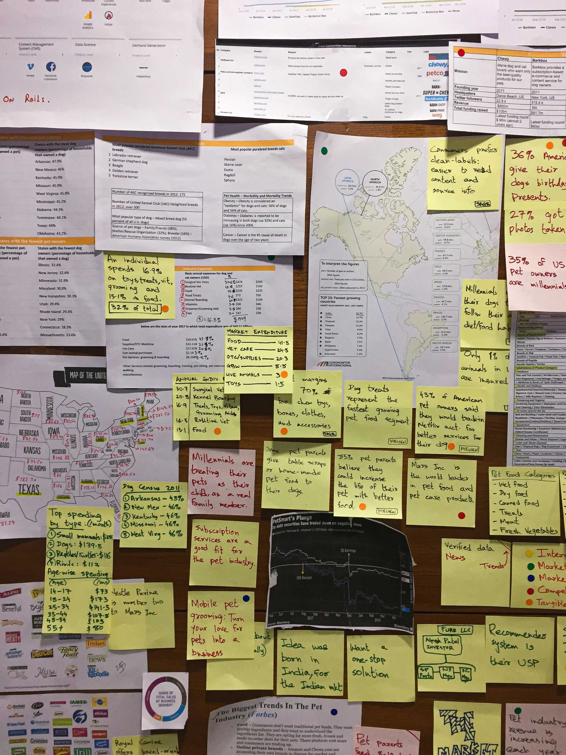
We went to message boards, YouTube comments sections, Reddit rabbit-holes, to find out the public sentiment for existing pet care brands in USA.
We saw a market that had gotten used to a clear monopoly.
Strategic Direction
Finding an empty ladder to be the first upon
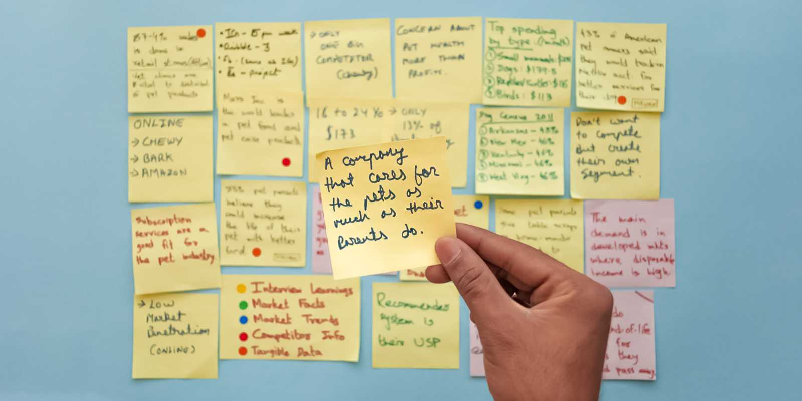
I tried to find a unique positioning. Reorganize. Nothing worked.
What we default to is heart. From this lens, we saw the division of the market as the ones who see customers as Pet Owners and the other as Pet Parents. We chose to serve the latter ones.

The client's enthusiastic response held us on. We formulated this positioning into a strategy and set the plan in motion.
The client's enthusiastic response held us on. We formulated this positioning into a strategy and set the plan in motion.
Creative Direction
Following the advice of Hans Zimmer, I applied the idea of subtext and reflected it throughout the Brand. Every touchpoint depicts a different aspect of the Brand. A different flavor.
But centrally connected to one
Symbols
Transmission of the feeling I had experienced
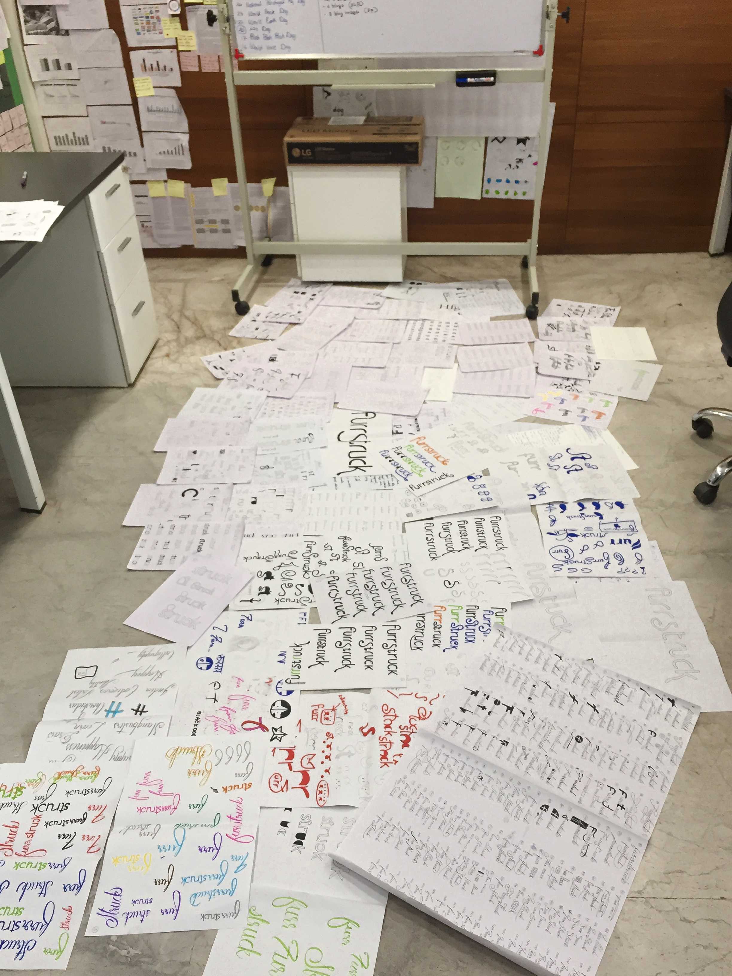
We designed many concepts but they were not exact. They were not looking the part, playing the part.
As if by a cosmic fluke, I had befriended a stray cat near our apartment. I used to feed her, play with her. Within a few days, she took a place in my heart. I singled out one of the aspects, the warm fuzzy feeling when you place your hand on your pet. The face that your pet has when you do that, is the Furrmark.
Sidebar on Mark performance
The warmth is conveyed through just 3 strokes. This mark removes our need to create a dog and a cat separately since this is inclusive of both. Here’s where the symbol frees itself from the norm of competitor logos showing dogs in cats, dogs next to cats, cats over dogs.
This one reflects the feeling.

Interface Design
Too much sweet really kills the mood
When we talk about the different elements depicting different flavours in the same dish, the interface too went through this treatment.
We knew that the users of this website would mainly use it to purchase pet supplies and toys. We kept the site’s interface to resemble your child’s lunchbox. Not visually or functionally but emotionally. Look at it, you’ll know what I am talking about.
Payment Flow
1/4
A real positioning pickle

This project was a showcase for the craft of converting insight into action and emotions into symbols.
Given the nature of the market Aleyr was in, we were presented with a difficult challenge of market positioning. To solve this, we observed closely and found the division between a pet owner and pet parent to be true. This simple insight changed the way the client looked at their own brand. It freed us from the pressure of making the brand look a certain way. From this inner center, we were able to implement a real sense of playfulness and sincerity in the objects we created, with a little help from H. Zimmer's idea of different flavours for different planes.
Colour
Direct extensions of playfulness
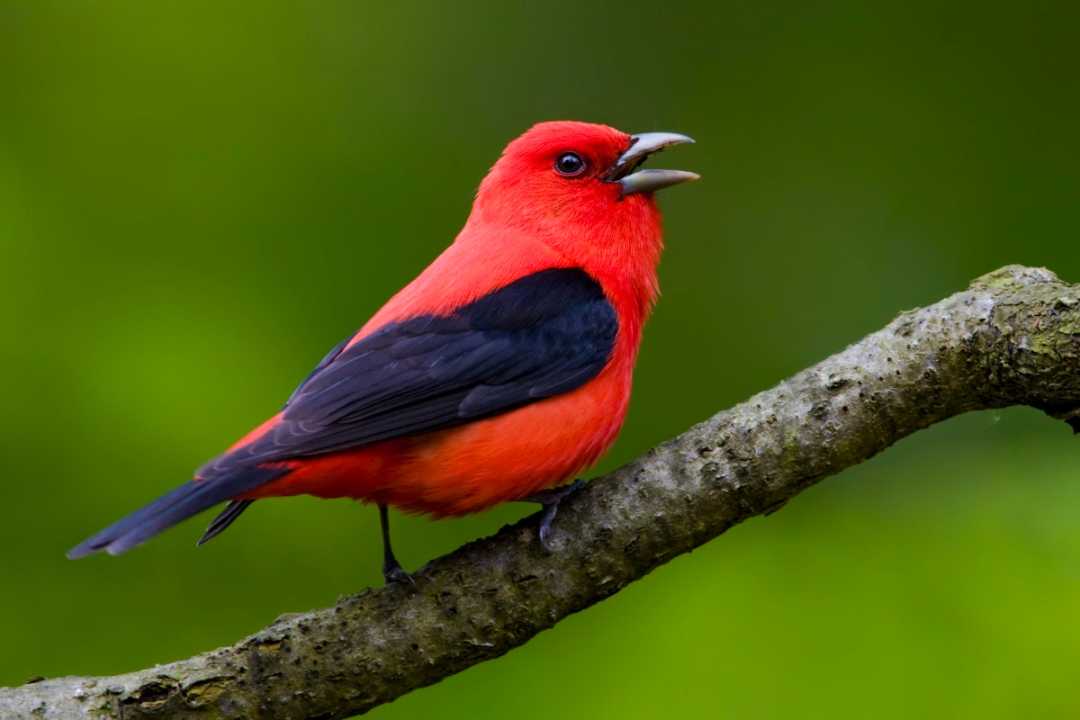
On the plane of colours, I chose to play a chirpy riff.
What is the subject of curiosity for them dogs and cats? Birds! The colours were an extension of this one very specific and not at all vague element:
startled eyes of your pet.

Branding is not magic. A good branding program brings total clarity of vision.
That vision gives solutions to long-standing problems. Action generated towards these solutions in turn generates proactiveness in the employees and trust in the customers. And we all know the value of trust.
So yes, branding is not magic. Magical? Yes. And there's a definite craft to doing it.
